We want our reports to look nice but also be functional, clean and uncluttered. Most people read from top to bottom and from left to right, and will scan with the eyes from the top left of the report page in a zig-zag motion across the screen. Having this in mind, we should think about putting the most important things on top, and organize the visuals on the page in such a way that it is easy for the audience to take in the information in the report.
Tournament Overview report
We are now ready to add fields and visualizations and build the Tournament Overview report.
Switch to Report view in Power BI Desktop. Here we can create several report pages with visualizations. Rename the Page 1 to Tournament Overview, and let’s start by adding a logo image for WTA Insights. Choose the Image option of Insert ribbon bar menu, and place the logo image it in the top left corner.

From the Visualizations pane, add a Slicer visual to the report and from the Fields pane select Dates > Year, then convert the visual to Dropdown.

To customize the visualization, in the Visualizations pane, select the paint roller icon to view available format options. Move the Single select slider to On, the Slicer header slider to Off, the Title slider to On and in the Title text field change the title to Year. I have also changed the Font color to #1B7A98 and Text size to 16.

Following the example above add a new slicer for Tournaments > Tournament. You should get the following result:

Add a Card visual and from the Fields pane, select the measure Selected Tournament that we have created in the previous post. Note that it reflects the current slicer / filter selections.

Click the paint roller icon to format the card visual and move the Category label slider to Off. This will hide the measure name and only display its value in the visual.

From the Visualizations pane, drag & drop a Table visual to the report, then in the Fields pane expands the Matches and Players tables and select the following fields: Matches[Round detail], Players[Flag], Players[Player name], Matches[Opponent flag], Matches[Opponent], Matches[Score], Matches[Duration].
The active relationship between the tables Matches and Players is Matches[Winner Id] and Players[Player Id]. This means that the Players fields we have added to the visual are the winner’s flag and name. Rename the headers to Winner Flag and Winner respectively.
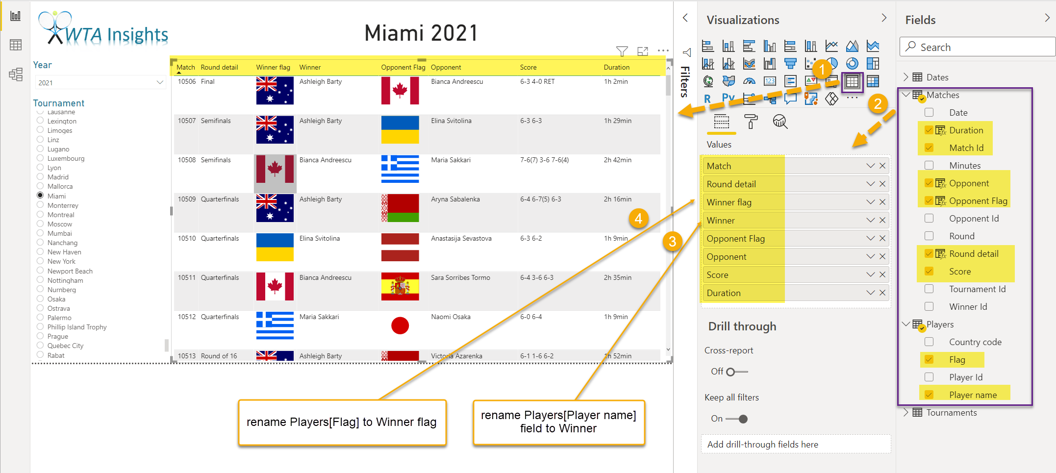
Let’s format the table visual. Click the paint roller icon, expand the Title section and move the Title slider to On. Set the Title text to Matches and change the font color and size.

Expand the Grid section and increase Row padding and Outline weight to 2 each. Set the Image height to 25%. This will make the flag images smaller.
Expand the Column headers section and set Outline to Top + Bottom and change the font family.

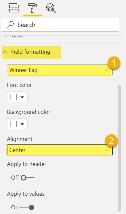
Expand the Field Formatting section. Select the Winner flag \ Opponent flag fields and set the Alignment to Center.
Select the Winner \ Opponent fields and choose different font colors.

Your report should now look like in the image below.

Change the slicer selections to see the list of matches, who played and who won at different tournaments. 🎾🏆
Want to learn more?
Power BI visualization best practices by Marco Russo
